A11y on mobile: how to build UIs that don't break
You should be aware of the accessibility settings on mobile devices which might break your app's UI. Let's see what we can do in React Native

Many believe that developing a mobile app doesn’t require you to build a responsive UI because, well, it’s already for mobile. I’m sorry but I have to tell you that actually, it’s much much more complicated than that… let’s see why.
Responsiveness
This term is widely used in web development. When you design a responsive web app (or website), the app will adjust gracefully to different screen resolutions.
This is of course also the case in mobile apps. Even without including cross-platform apps, but just iOS, we have a big number of iPhones to support and even iPads if we want the app to be compatible with them too. So imagine how much of a variety of devices and sizes you have to support when you start developing apps with tools like Flutter or React Native.
Why accessibility
Accessibility is a very well-known topic on the web and it’s about allowing people with physical or situational disabilities to access websites, web apps, and so on. Of course, it’s no different on mobile.
But to truly understand why certain practices and techniques have been put in place, one should inspect what kind of accessibility tools are available in mobile and desktop operating systems that make people’s lives easier. There are tons of different tools, also based on various people’s disabilities, but the two we’re going to focus on in this post are the ones that often cause layout and UI problems that developers don’t even notice: font size and display zoom.
So, why does accessibility matter when talking about responsiveness? The reason is quite predictable: changing the sizes of the elements on the screen, can (and very likely will) break your layouts.
N.B: At this point, I will stop talking about the web environment, and instead I’m going to focus on mobile devices and the way we can face these problems when developing apps with react-native.
Display zoom
Did you know that a pixel is not a pixel? As you know, nowadays devices have displays with huge resolutions. If I’d be able to draw an exact “physical” pixel on the screen it would be very very small. The pioneers on higher display resolution on mobile devices are the Apple engineers, with what they used to call “Retina displays”. They basically split the pixel concept into a physical and software one meaning that while developing on an iPhone 7, for example, if I set an element’s width to 40*, the actual pixels occupied on the screens are 80.
Why exactly is the width multiplied by two and why specifically the iPhone 7? Would it be different with another smartphone?
Yes, it would have been different based on the specific device. Let’s see why.
N.B: both Android and iOS work this way.
*in React Native we’re used to referring to this measurement unit as “dp” which stands for “independent pixels”.
The pixel ratio concept
To know how many times you should multiply the dp (the units you normally use when developing in React Native) to get the physical pixels, you need the scale factor (called pixel ratio) that you can get using the PixelRatio class and calling the “get” method: PixelRatio.get().
The bigger the display resolution is, the bigger this ratio might be (depending also on the display inches).
At this point, you might think that app responsiveness is done automatically through this pixel ratio. Sadly not.
That ratio is just an approximation value that tries to render the UI in the most similar possible way between various smartphones and tablets, but it’s not perfect at all.
What does this have to do with accessibility?
Accessibility here complicates things a bit. In fact, through an accessibility setting called “display zoom”, you can change the total number of software pixels in the display.
Have a look at both the Android* and iOS settings page:
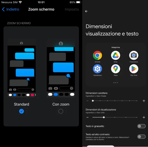
*Being Android vendor-specific, you might have a hard time finding these configurations in specific smartphones.
An example
Confused? No worries, let’s illustrate a clear example.
The iPhone 7 has a hardware display resolution of 1334px height × 750px width.
This means that if you call Dimensions.get('window').width in React Native without having your display zoomed, you’ll get 375dp because Apple has set the PixelRatio of that device to 2 (750px/2 = 375dp).
Now if you enter zoom mode and try to do the same call above, you’ll get this time a total width of 320dp, so as you can understand, the iPhone reduces its total display width usable by the developer, and therefore our UI components will look larger.
Let’s continue to think up a bit together.
We have two problems now:
- Being sure that all devices’ resolutions render the UI the way we want
- Make sure that whenever “display zoom” is enabled, everything renders correctly
Very well. If we understood that the “display zoom” setting basically tricks the apps into thinking that they’re running on a smaller display resolution, it means that once we find a solution to one problem, we have found it also for the other one.
The solution: percentages
Considering that React Native allows us to know the device resolution, what you want is a function that behaves like the percentage unit in the web. So you give ‘10%’ and it returns to you: screenWidth * 10 / 100
Why can’t we use them directly? We can’t because percentages are not allowed everywhere in React Native. To mention a few properties that don’t support them: margin, border-width, border-radius, and font-size.
This solution has been packaged here (by another dev): react-native-responsive-screen
N.B: Don’t trivialize this solution just because it is a simple formula. All the thinking process and the knowledge to get here, as you saw, it’s the hardest part.
Font size
Another accessibility setting you’ll find on smartphones is the font size setting. I won’t show you Android since in the previous screen there are both display zoom and font-size settings:

Font size setting in iOS
This is also plausible to break your UI very often, especially if your layout has many “width” and “height” properties set.
Many times, like when developing buttons, you are better off using padding to define their size. But if a certain box must have a specific and fixed width and height, then you need to use the PixelRatio.getFontScale to know how the scale has been set on a particular device through the accessibility settings.
Be aware that there is also another possible solution that is strongly discouraged, which is the use of the allowFontScaling={false} prop for the Text component. As the name suggests, whenever the user changes its accessibility settings, your app will stay the same.
Another useful prop might be the minimumFontScale which does what it says :)
Conclusion
I firmly believe that accessibility on mobile is even a darker area than web accessibility. I hope I shed a bit of light on it.